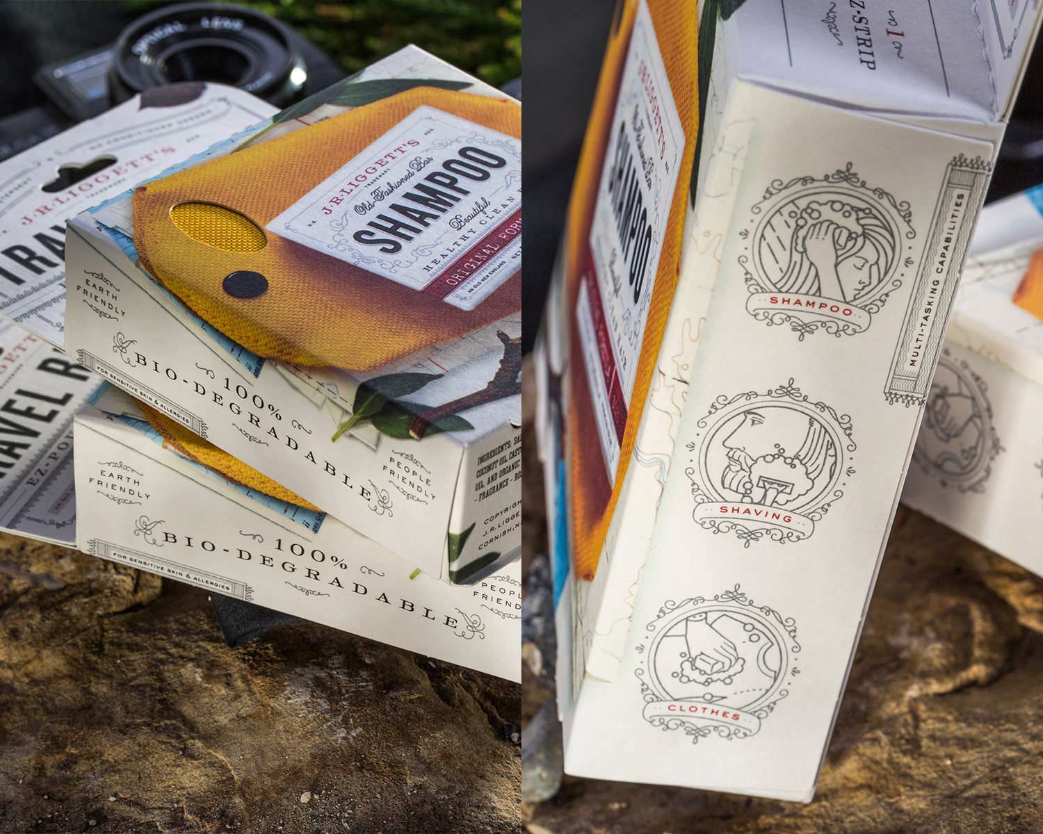
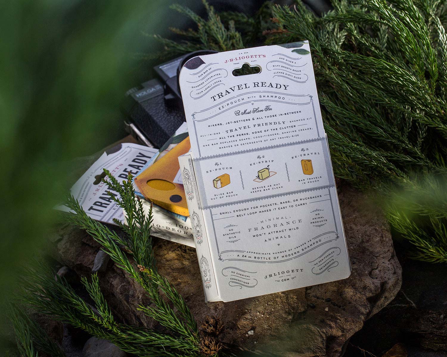
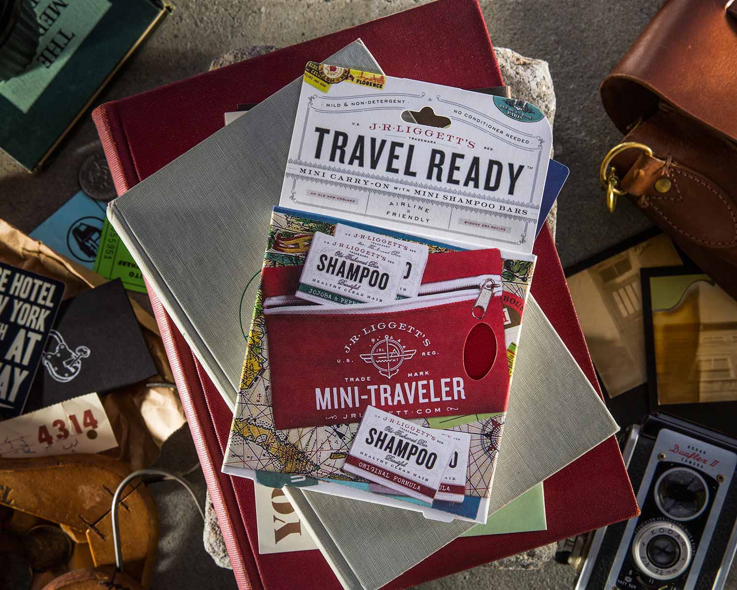
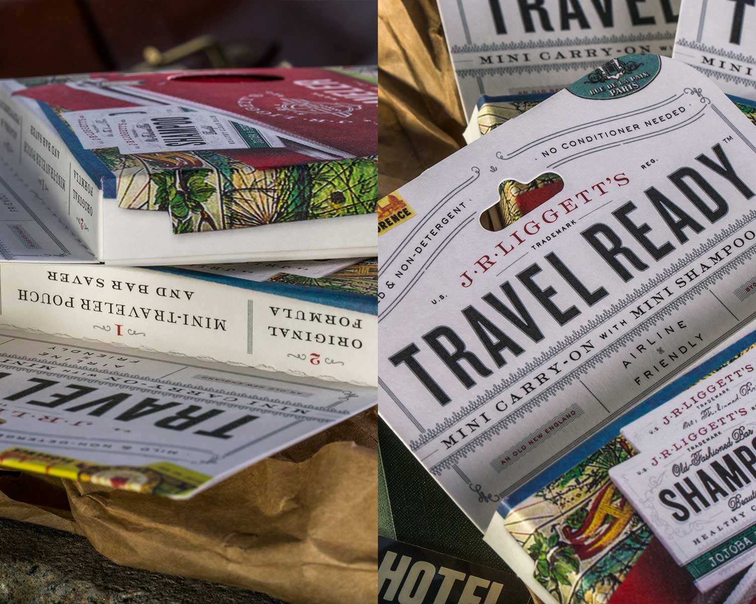
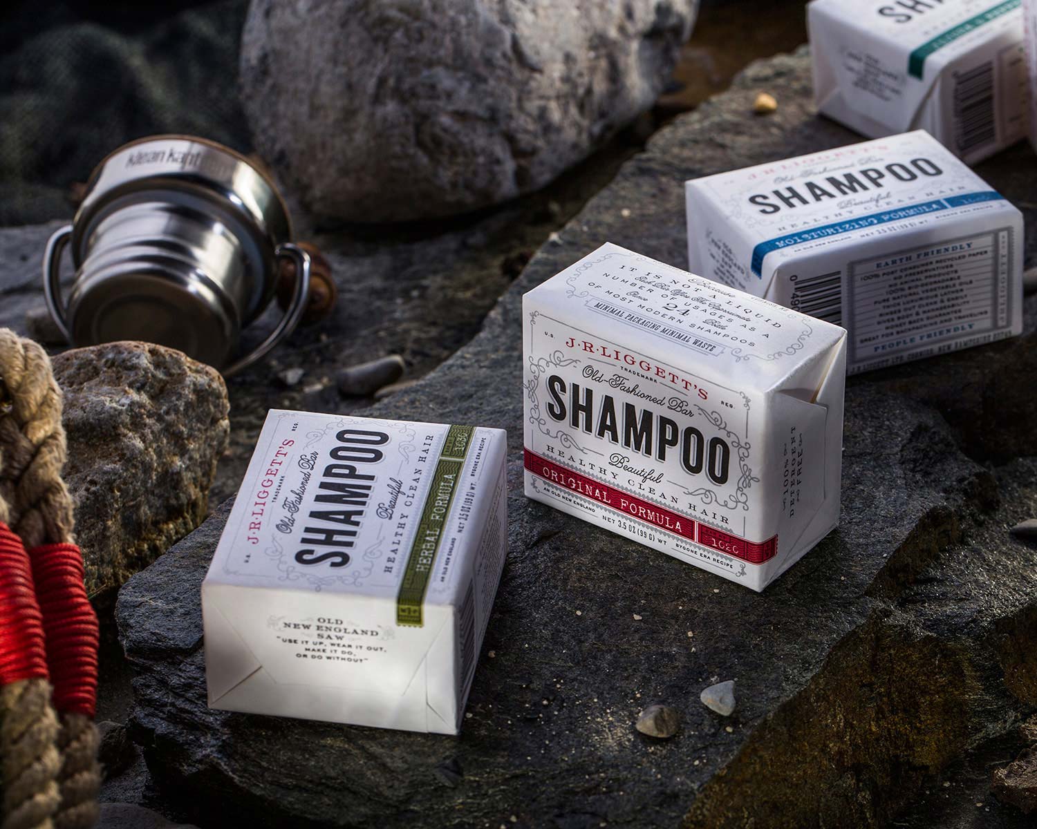
J.R. LIGGETT'S

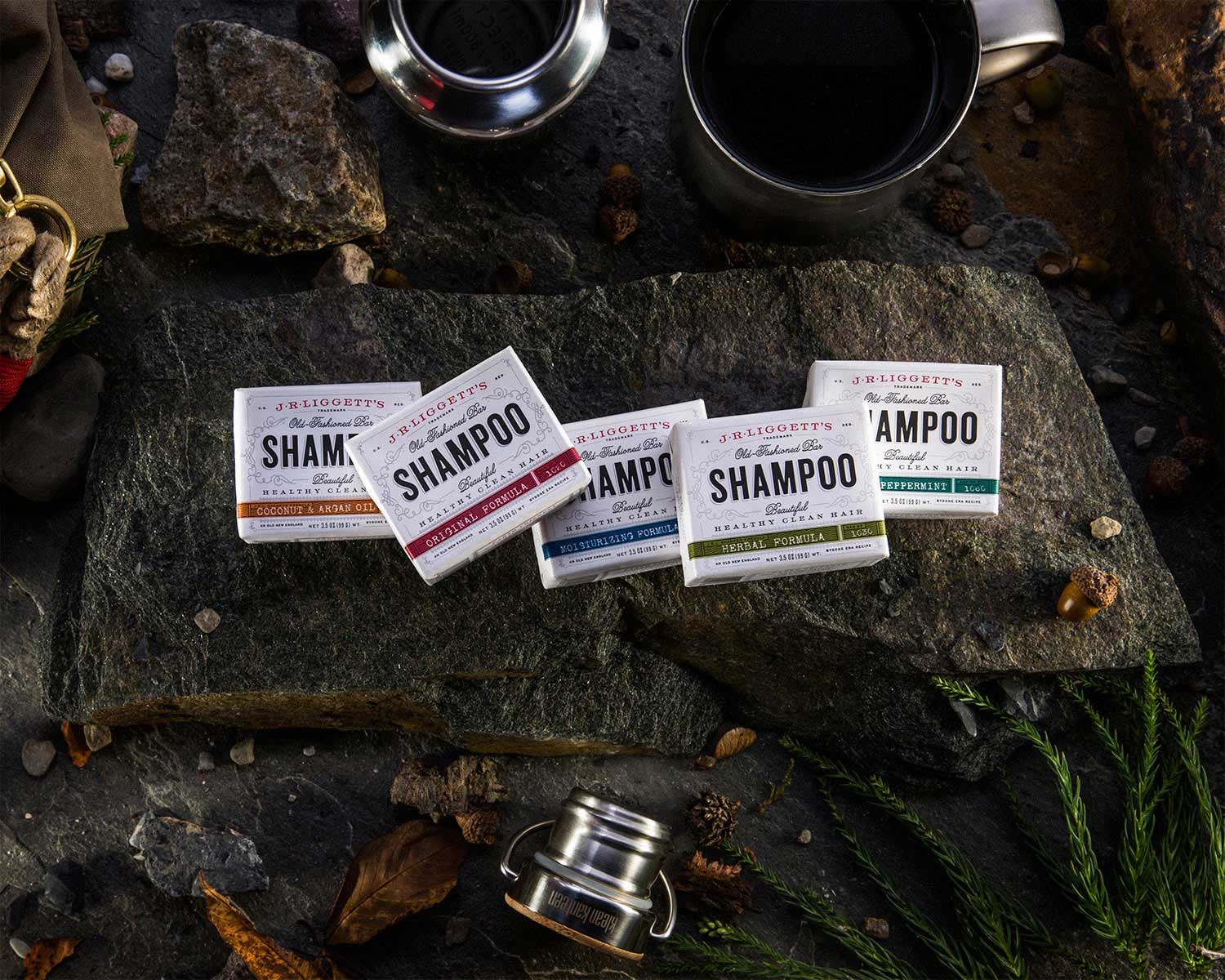
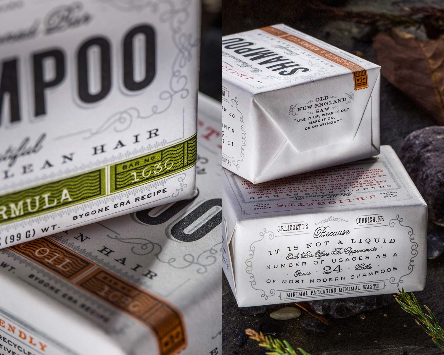
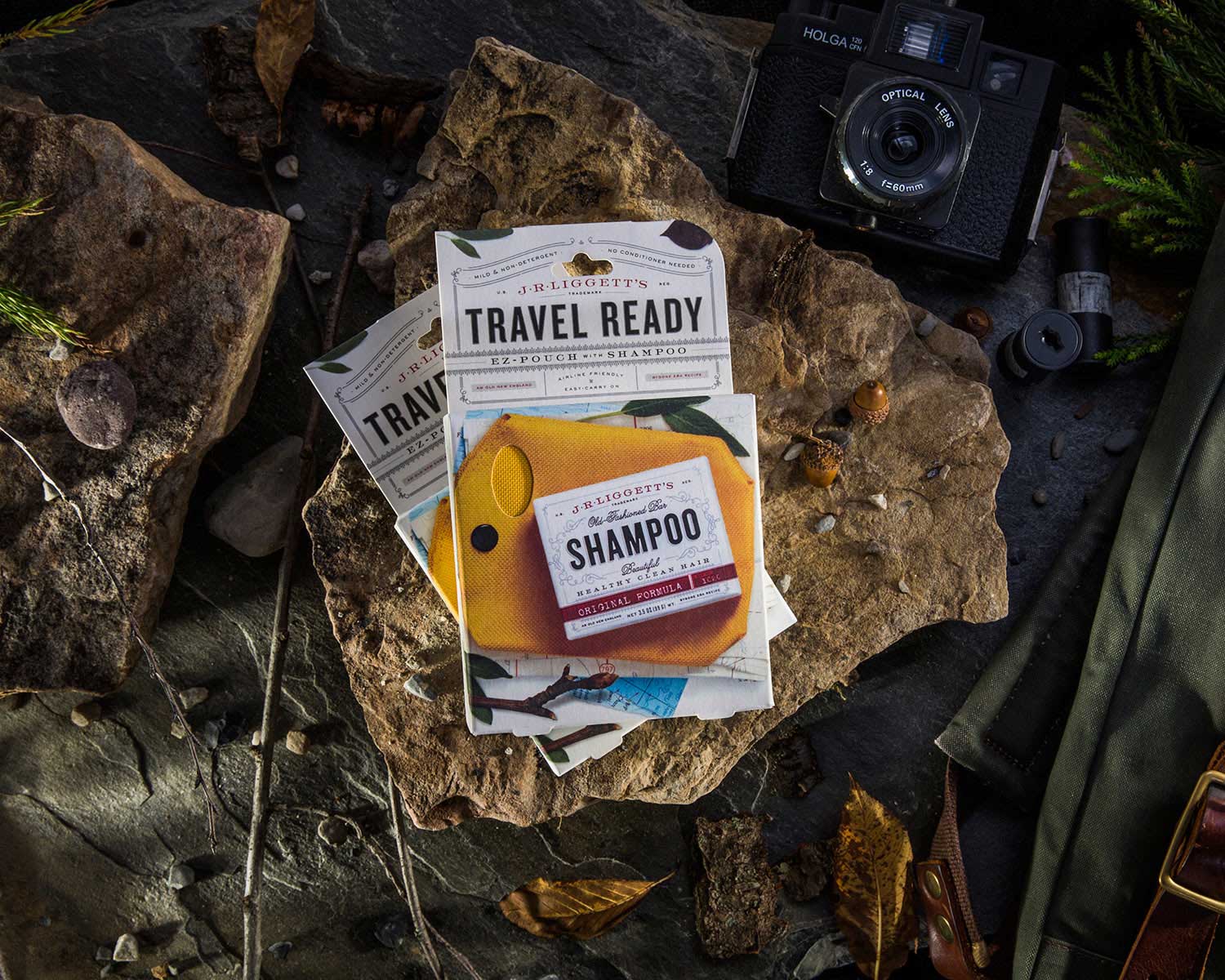
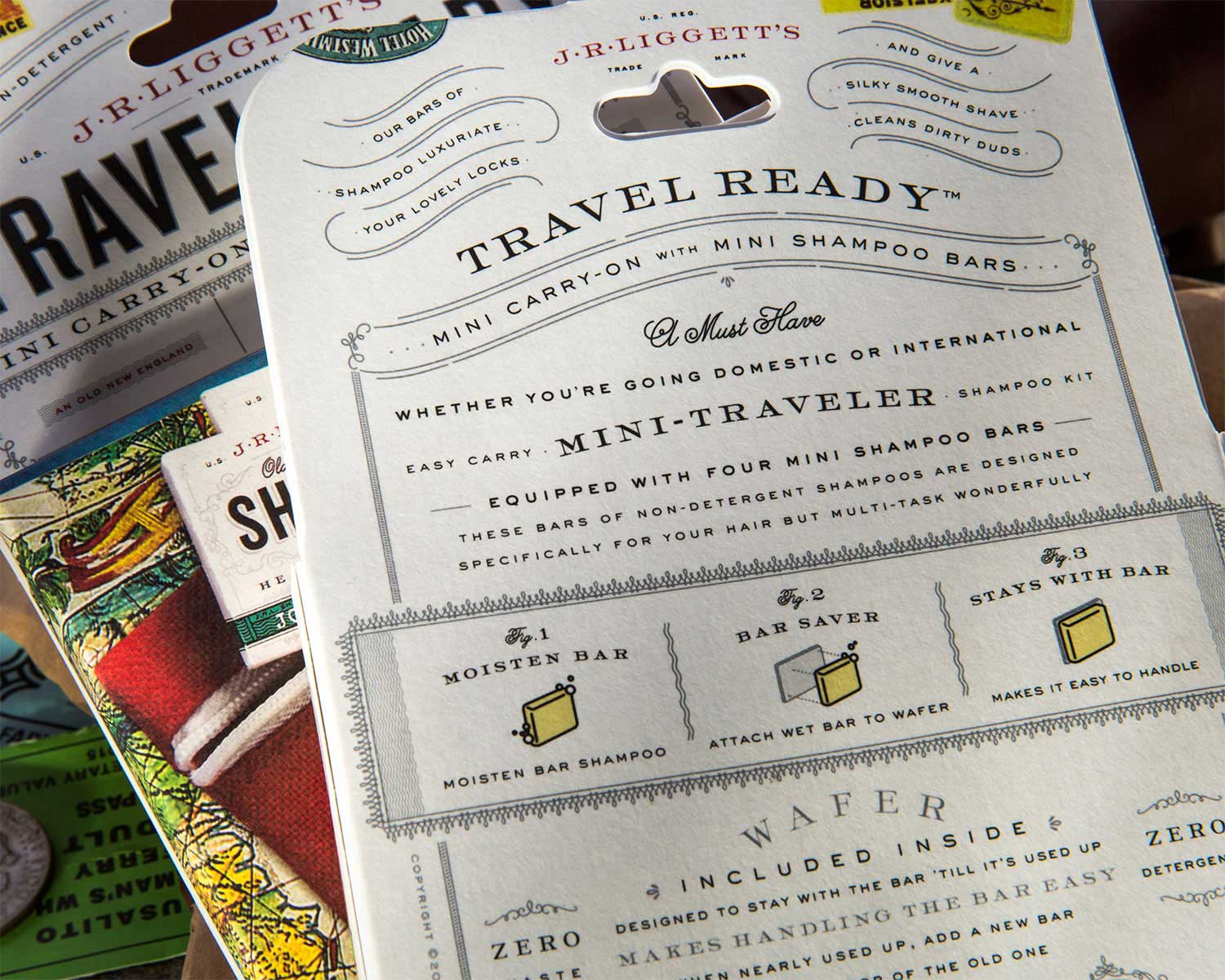
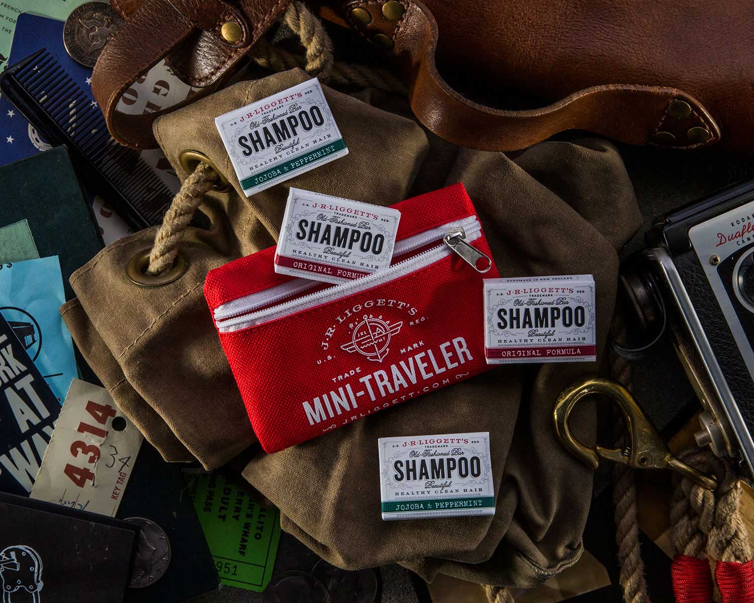
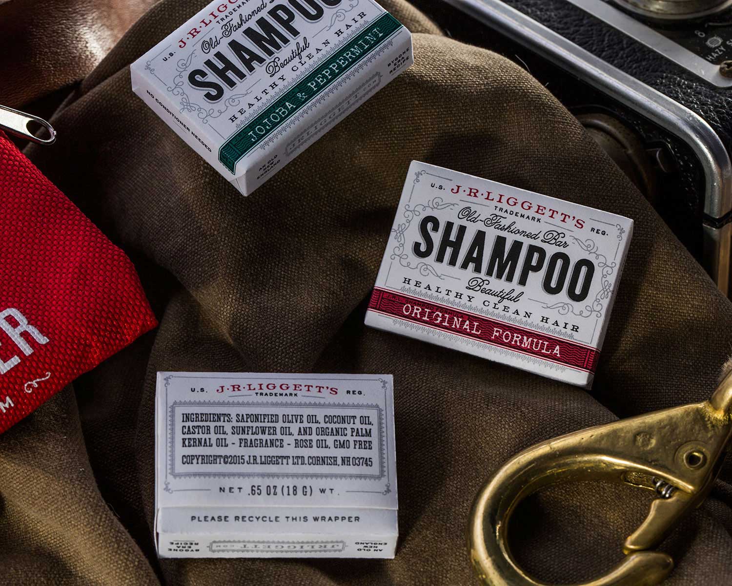
For 30 years J.R. Liggett’s has been creating all-natural bar shampoo and bath products. An expanding product line and reach meant it was time for a branding overhaul. We were approached to develop a defining, overarching visual identity that would propel the brand forward with new appeal to both consumers and retailers. 

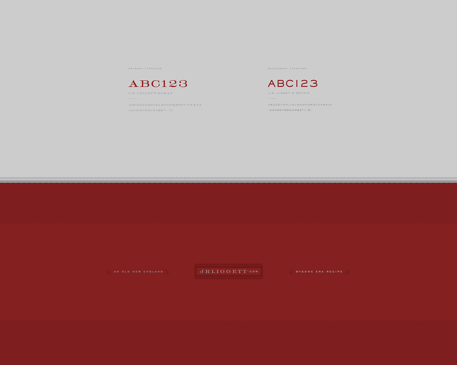
We retained elements of the brand’s existing vintage aesthetic and spartan packaging style, while modernizing it via bold typography choices, personality-rich copy and uncoated paper stocks that lend a fresh, clean feel. 


SERVICES

BRAND POSITIONING
BRAND IDENTITY
COPYWRITING
ICONOGRAPHY
ILLUSTRATION
MESSAGING
PACKAGING
PHOTOGRAPHY


AWARDS & PRESS

CA TYPOGRAPHY ANNUAL
GRAPHIS
HOW INTERNATIONAL DESIGN
PACKAGING OF THE WORLD
PRINT REGIONAL DESIGN ANNUAL
THE DIELINE


A new focus on hierarchy and legibility clearly communicates the product details – a sturdy, condensed font in large point spelling out shampoo ensures there’s no mistaking the product for a simple bar of soap, while all-caps text keeps all the essential details clearly in focus. 

Similarly, a black and white palette provides a striking backdrop for the accent colors used to differentiate the shampoo varieties, ensuring each product can be distinguished at a glance. The minimal use of color elsewhere highlights the minimal ingredient list, while small sidebars call out the brand’s traditional methods. These elements come together to continue the story of a company proudly rooted in the artisan approach of a bygone era.

It’s an identity that brings together resourcefulness, nostalgia and plenty of character.