A STRONG SENSE OF SELF STANDS OUT ON THE SHELF.
A great brand is always more than skin-deep. Delivering a great-looking identity is the bare minimum. To tap the local and national markets we had to go deeper than looking good on the shelf.
Through a brand development workshop, research and collaboration, we discovered they’re all about authenticity, heritage and strong local roots. Bay City locals from way back, they’d begun distilling as a way to spend time together. Their story is one of perseverance, drive and connection – all the factors that today’s consumers expect a brand to embody, and are willing to pay a premium for. The brand had to be rooted in this.
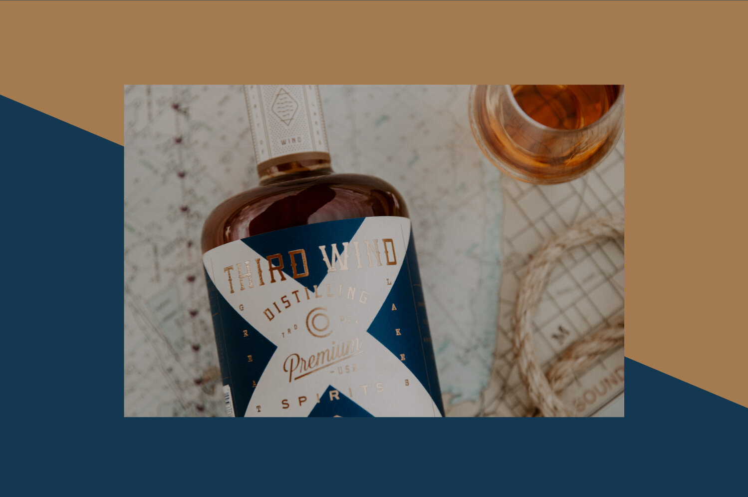
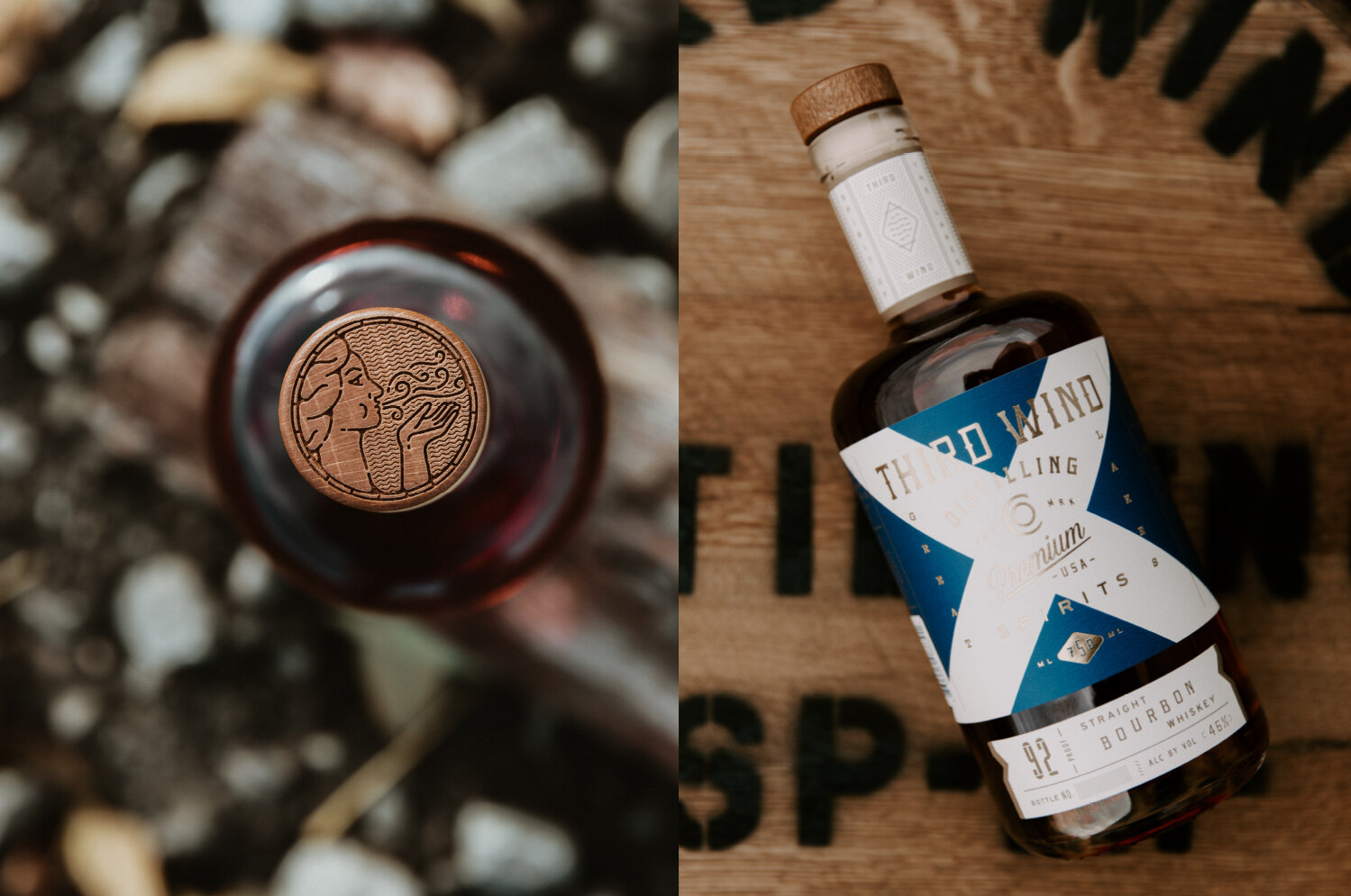
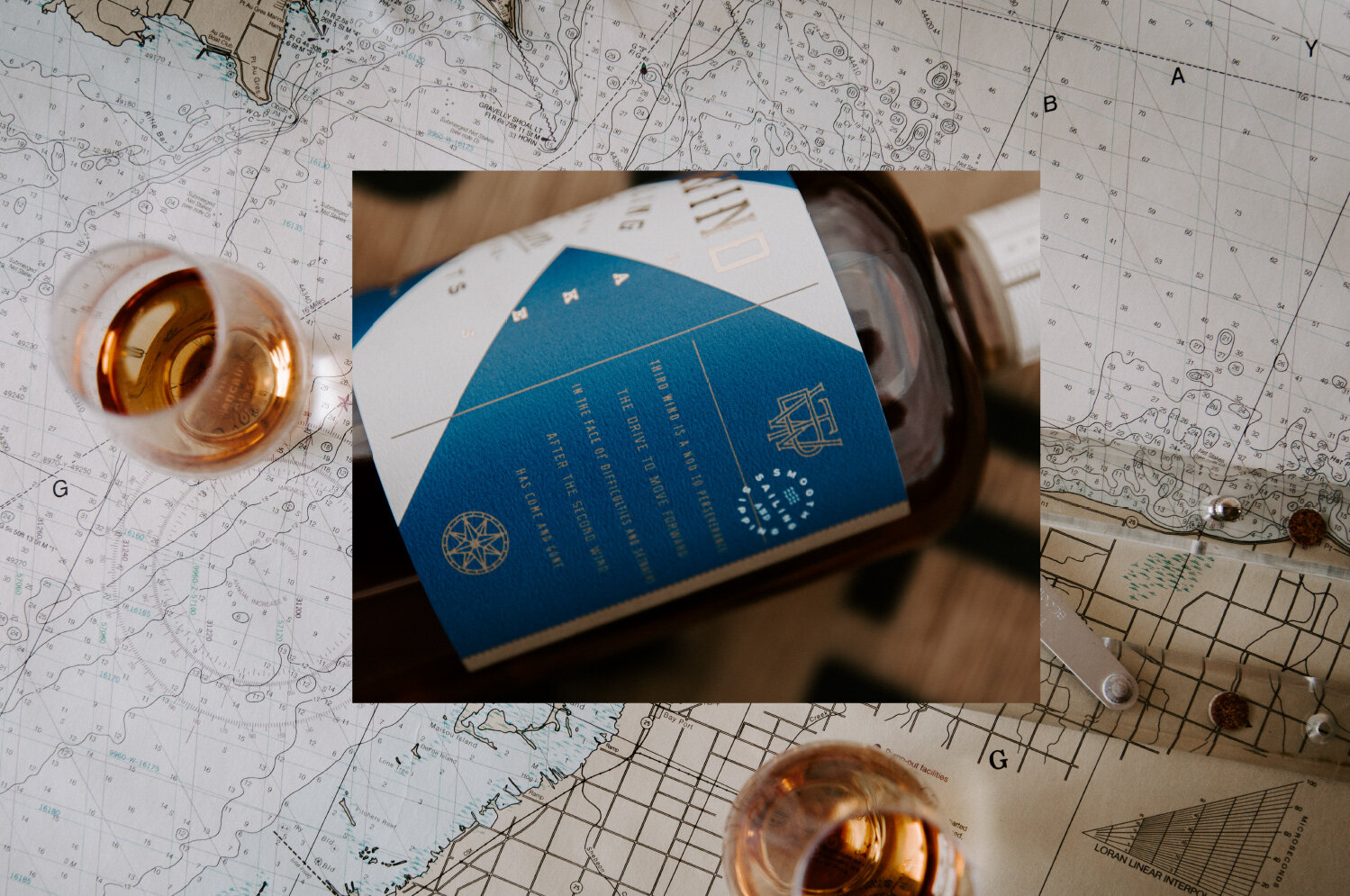
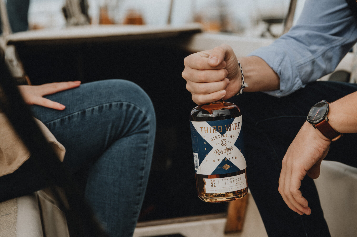
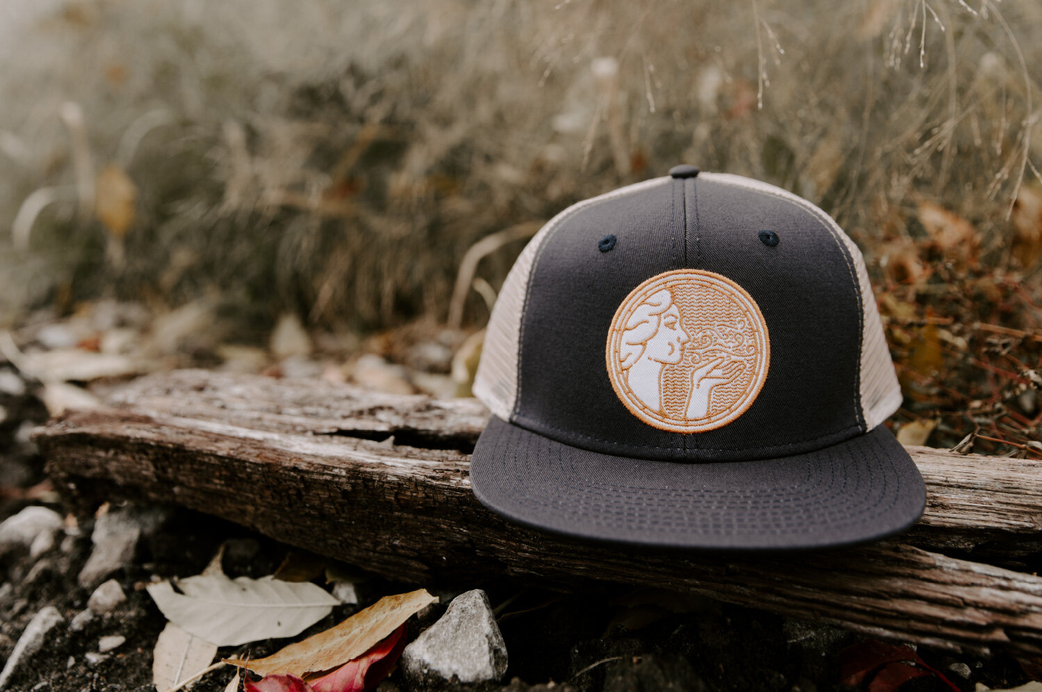
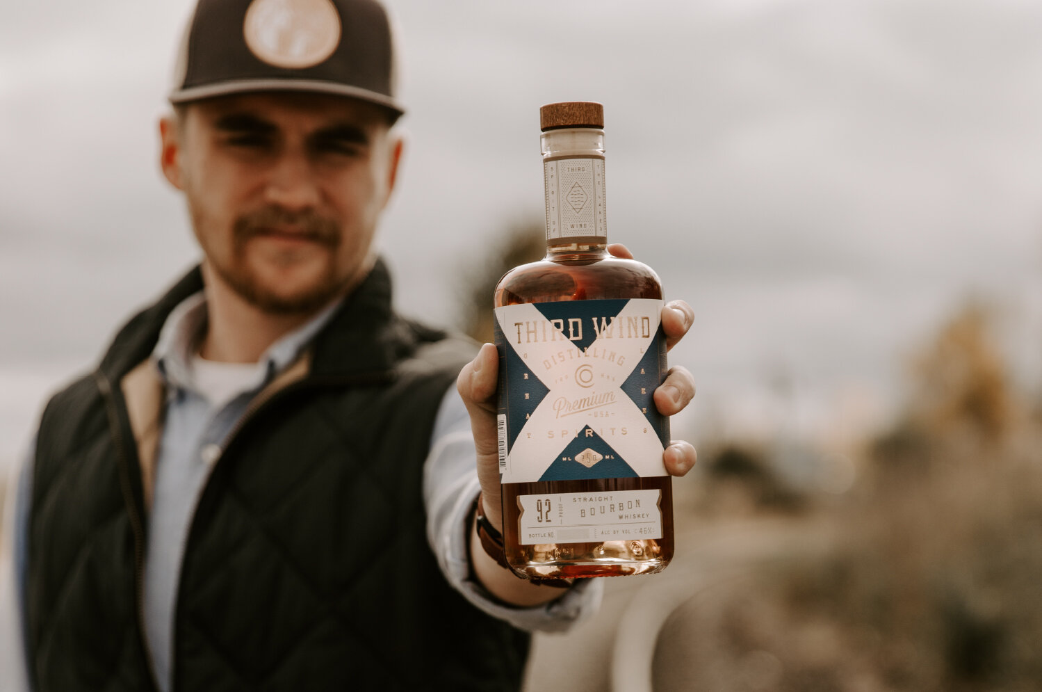
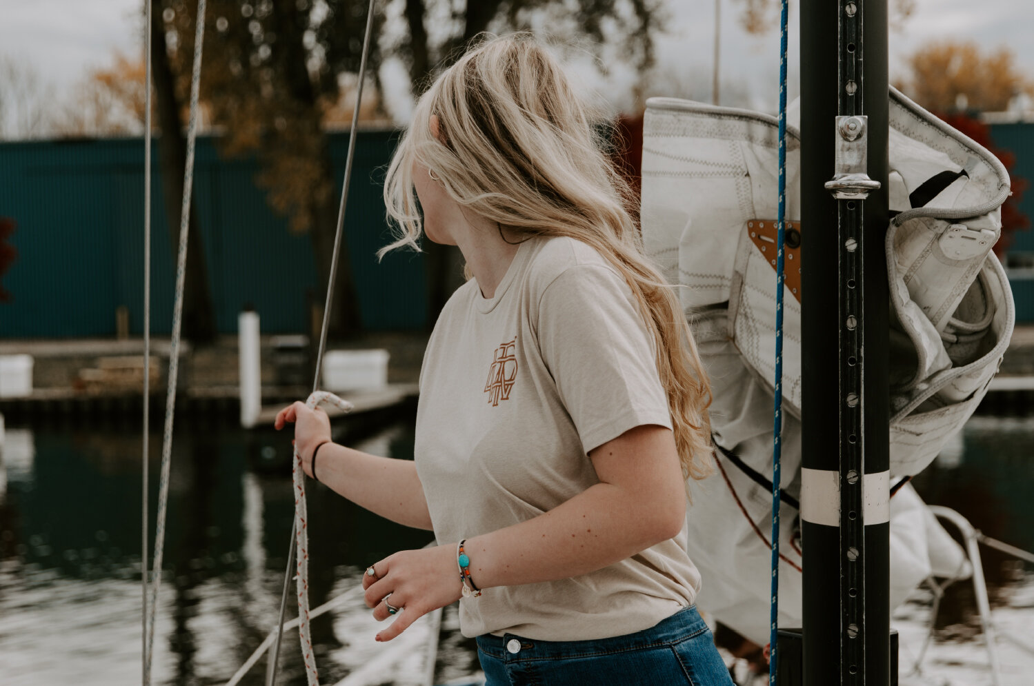
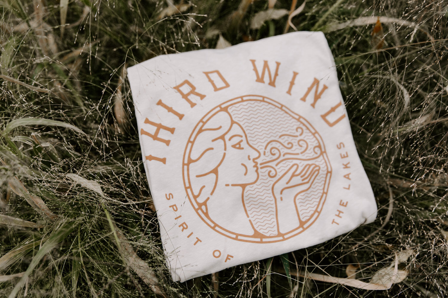
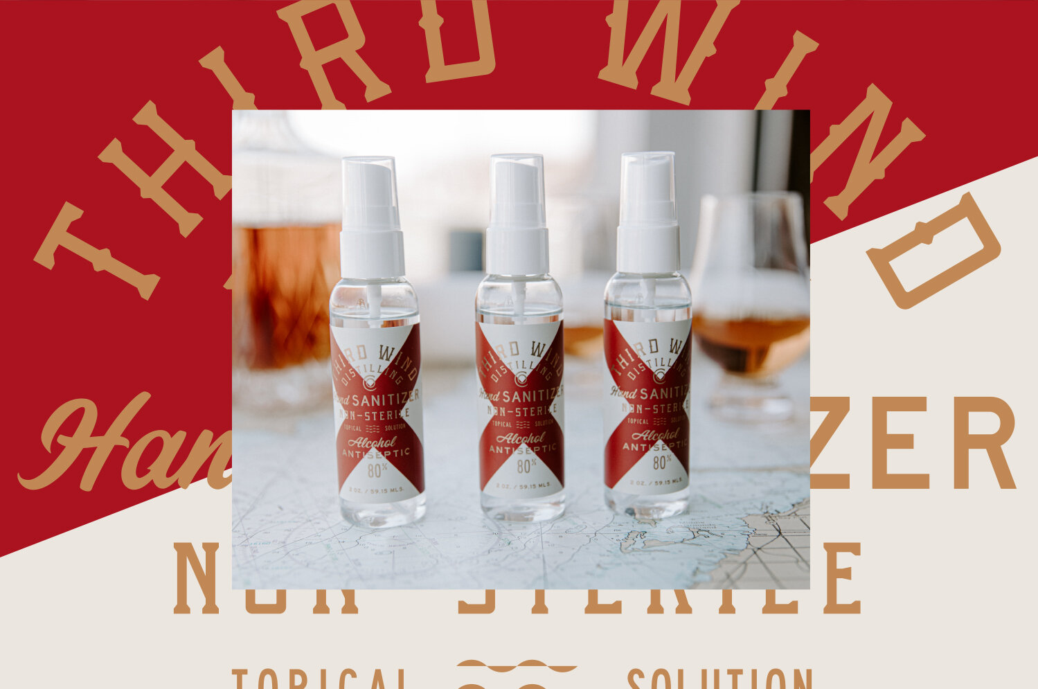
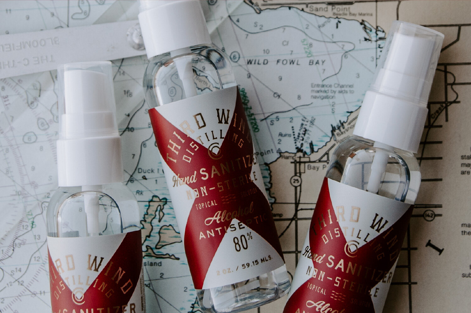
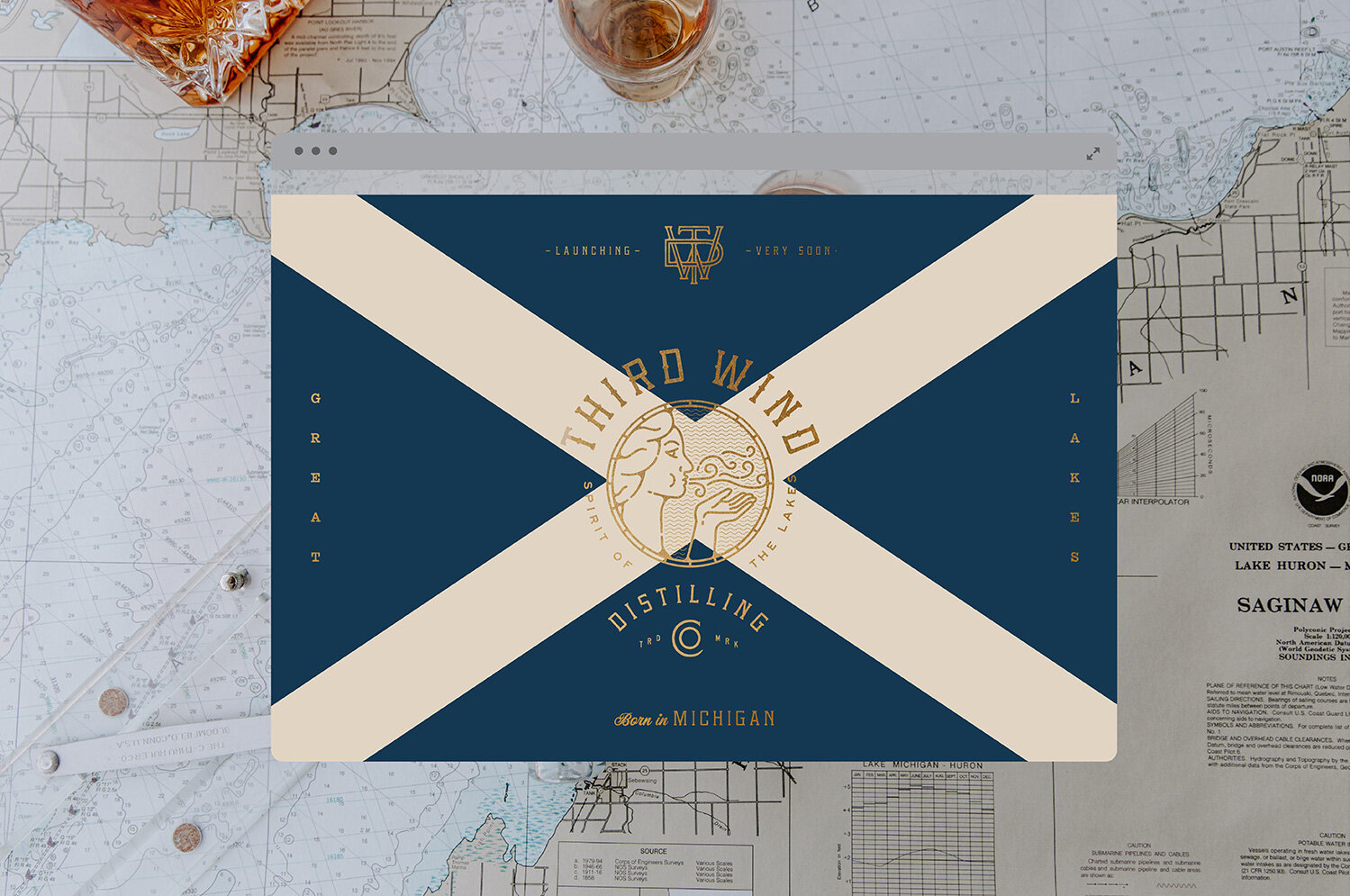
Naming was tough in this busy space. After a few iterations with legal we landed on Third Wind, with its evocations of pushing through together in tough times – and a nod to Bay City grit. Branding, identity, web, packaging design and merch followed. These centered around the family’s history and heritage, yet with plenty to appeal to those outside the inner circle. Bay City roots are referenced in a bold take on the maritime code of signals, an eye-catching system of symbols rich with meaning for the seafaring crowd – and yet striking when encountered on a major metro bar shelf. Gutsy language and locally anchored motifs that speak to that all-American trait of sheer dogged determination abound.


